Welcome back, friends!
Last week I showed you some of the skull linocuts I've been working on. This week, I'll show you the other two color schemes.
The second color scheme I decided to do was turquoise, red, coral, and black. I lived in Arizona for several years, after all, so I've long had a penchant for southwestern colors.
Here's the first printing, with the turquoise:


After I carved out the second section, I added the red section. When layered over the turquoise, it took on a maroon character.


After I'd carved out a bit more, it was time to do the coral section.


And then we finally add the black outline:


Lovely!
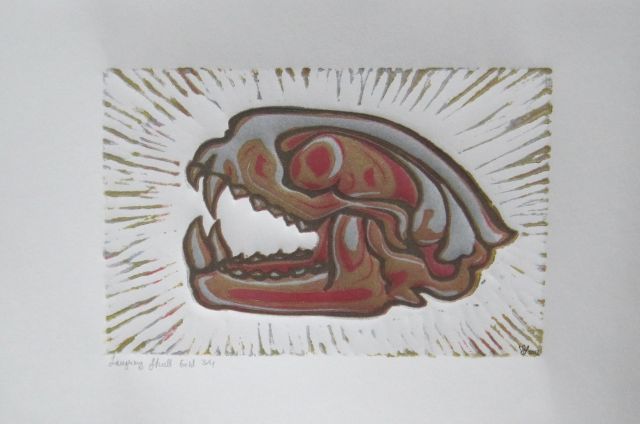
Now, the final color scheme involved a lot of metallics, which I typically don't use. I had used some silver ink at the studio just to test out the images, but I liked how it looked so much that I decided to do a silver scheme.

As with the other prints, I used red as the second color. Like the turquoise-schemed prints, it ended up more of a maroon color.


At the risk of getting Burl Ives and that song "Silver and Gold" stuck in my head, I used gold as the third color:


Finally, I added the black outline:


So there you have it. For the yellow and turquoise schemes, I made 10 prints of each image. For the metallic, I did only 4 because I wanted to make it a "special edition" of sorts. That means there are 24 prints of each skull, in 3 color schemes. Add them all together, and you get a total of 96 prints. Whew!
No wonder I hadn't done this in a year.
Last week I showed you some of the skull linocuts I've been working on. This week, I'll show you the other two color schemes.
The second color scheme I decided to do was turquoise, red, coral, and black. I lived in Arizona for several years, after all, so I've long had a penchant for southwestern colors.
Here's the first printing, with the turquoise:


After I carved out the second section, I added the red section. When layered over the turquoise, it took on a maroon character.


 |


And then we finally add the black outline:


Lovely!
Now, the final color scheme involved a lot of metallics, which I typically don't use. I had used some silver ink at the studio just to test out the images, but I liked how it looked so much that I decided to do a silver scheme.

As with the other prints, I used red as the second color. Like the turquoise-schemed prints, it ended up more of a maroon color.


At the risk of getting Burl Ives and that song "Silver and Gold" stuck in my head, I used gold as the third color:


Finally, I added the black outline:


So there you have it. For the yellow and turquoise schemes, I made 10 prints of each image. For the metallic, I did only 4 because I wanted to make it a "special edition" of sorts. That means there are 24 prints of each skull, in 3 color schemes. Add them all together, and you get a total of 96 prints. Whew!
No wonder I hadn't done this in a year.
Comments
Post a Comment
Questions? Comments? Speak your mind here.