Readers familiar with the Fanciful Lobster have seen me experiment with a fairly varied array of media, including iterations of drawing, intaglio printmaking, ceramics, digital artwork, and collage, so it may come as a surprise that I've never regarded myself as a painter. Sure, I painted in art classes and completed a few murals as a teenager, but it's rarely been my medium of choice. Until a few days ago the last painting I completed was last spring, when I took a weekend workshop at the museum. Over the course of the two-day class I completed a still life with a deer skull and katsina. My classmates loved it, and my sister now has it hanging in her home, but I'm not entirely satisfied with it personally. Partly this is, I suppose, the ever-present realization that you can always do better, but it's also the medium itself.
I'm not entirely sure where my ambivalence originates, but I know my art historical background has definitely influenced it. Of all the visual media, painting is probably the most debated and analyzed in both art history and theory, so it carries a lot of conceptual baggage that can be both intimidating and off-putting. It's not unlike why I tend prefer working on lesser-known artists within the art history canon as opposed to the household names. I can't tell you how many essays and statements I've read over the years that discuss the paint's material qualities in relation to content, as though the physicality of paint is more critical to the meaning of the work than it is in other mediums. I can still remember from my graduate school days a passage from James D. Herbert's Our Distance from God describing how the paint in Monet's massive l'Orangerie murals looked as though it had been licked onto the surface. Such readings excite me intellectually, but also make me feel as though I'm inadequately equipped to fully embrace and appreciate the material power of paint. And certainly I can't think of another technique whose death or non-death has been so vigorously questioned by artist, scholars, and critics. It's a medium steeped with history, and whenever I pick up a brush I can't help but feel that I'm suddenly in dialogue with the whole yawning legacy of human visual expression. With so many centuries of profound conversation having already taken place, it's a bit daunting to add something to it.
Regardless of the reason, I've never considered my work to be really all that authentic in terms of painting. It all seems artificial to me, like an imitation of a painting, or an extraterrestrial's take on what a painting should be. It's probably a holdover from the imposter syndrome that I experienced on a regular basis as a student (and still occasionally do): it's irrational, but I can't quite shake the idea that while I may be able to fool the average viewer, a real painter would immediately recognize that I'm faking it. My painting to me is like imitation crab meat: it tastes okay but isn't the genuine article.
I've always felt that I express myself more effectively in drawing, and perhaps that's one reason why I tend to prefer works on paper in general; it feels more energetic, more immediate to me than a painting often does. Going to the Van Gogh exhibition at the Art Institute last month and seeing his explosive works in person reminded me just how stilted and hesitant my own painting often feels to me. Indeed, the closest I've ever felt to being a genuine painter is when I'm creating monotypes.
Peter Hurd had similar struggles with oil paints in particular. While it was his mentor N.C. Wyeth's medium of choice, Hurd never felt fully comfortable with it, feeling it was too thick, too murky for his particular artistic vision. Not that I blame him: N.C.'s illustrations are practically exploding with masterful energy, and Henriette Wyeth had a subtle understanding of painting's ethereal dimensions by the time she was a teenager, so I imagine that would have been pretty daunting to live and work around. Instead, it was the dry translucency of egg tempera that seemed to express his artistic voice most effectively, capturing the eerie clarity of New Mexico light that fascinated him throughout his life. In a lot of ways, that's how I feel about printmaking. The process-driven nature of the medium reflects the overall methodical approach I take to my own life, while more drawing-based approached such as acid etching and sketching reflect my occasional bursts of spontaneity.
I have to admit though, it felt rather satisfying to have a completed that still life by the end of the weekend, considering how long it can sometimes take me to finish printing my editions, assuming I don't lost interest in them during the process. As part of the workshop I received two canvases, in addition to the paints. I took the second one home with the intention of doing another still life, but the inability to decide on a composition soon resulted in me putting the canvas in the closet and forgetting about it. After all, there were cups to throw, coloring books to make, and holiday cards to construct, not to mention my curatorial work, so it vanished. After all, I'm just a pretend painter, so what I do I care if I don't complete a second one?
About a year later, however, I found the canvas while reorganizing my closet, and decided it was time to use it up. I started the usual debate about what to paint, which was beginning to paralyze my resolve to work at all, until I remembered doing a series of sketches with eggs and drapery the previous winter. I reasoned that focusing on such a deceptively simple composition would allow me to concentrate more on the paint itself, rather than the minutiae of details. I excavated those sketchbooks and settled on the first composition, enlarging it on the canvas using the golden ratio to create a more balanced drawing. Whenever I paint, I notice that I become very traditional.
I pulled out my paints and prepared to work. For canvas paintings I tend to use acrylic, partly because it's what I know best, but also because I don't need my cat accidentally ingesting turpentine or stepping in oil paint.
Whereas with the skull still life I had launched right into putting color on canvas, for this work I decided to do an underpainting using a matte medium to thin my paints into translucent glazes. I worked in a pretty loose manner the first night, drawing in the forms with a burnt sienna:

On the second night I began building up the values to give depth to the composition.

The next night I decided to add a bit of warm by adding ochre to the mix, giving the overall composition a warm yellowish glow. After all, the original sketches had been done by candlelight, so I wanted to evoke that sense of light to some degree.

Now that I had built up a nice ochre-based composition, it was time to take a chance and add color. The eggs themselves were painted in the blues and greens of the actual shells. The original drape is actually woven with a floral pattern, but for this piece I distilled it to a single vermilion color. I debated a series of colors before settling on the red, but I'm not surprised that I would choose it. For me, red connotes warmth, the home, comfort. It's the color equivalent of the hearth fire, that trope of domesticity that's been celebrated since the nineteenth century. In retrospect, the combination of red and green also appears in a lot of my personal associations. The red I used here is pretty close in shade to the flowers blooming on my cactus right now, and the idea of red space with green accents is a concept I've loved ever since I saw the library in Sir John Soane's house in London as a college student. There's also the Christmas association, I suppose, and in the New Mexico vernacular in particular, "christmas" refers to a combination of red and green chili, say when ordering an enchilada. In short, it's a loaded color combination for me.


And here are some details:


I took a few liberties with the composition. The eggs weren't this speckled in reality, for instance, and I've concealed the cracks that developed in the shells when I was extracting the yolks. And of course, the drapery wasn't this solid red color. The beauty of art though, is that you can manipulate reality to suit your needs.
I still don't consider myself a great painter by any means, but this feels the closest to a real painting I've done in a while. So much so, in fact, that I'm thinking of expanding it into a series.
How typical.
 |
| The best part is my opinion is the eye socket and the base of the antler. The rest is an imitation in my eyes, albeit a good one. |
I'm not entirely sure where my ambivalence originates, but I know my art historical background has definitely influenced it. Of all the visual media, painting is probably the most debated and analyzed in both art history and theory, so it carries a lot of conceptual baggage that can be both intimidating and off-putting. It's not unlike why I tend prefer working on lesser-known artists within the art history canon as opposed to the household names. I can't tell you how many essays and statements I've read over the years that discuss the paint's material qualities in relation to content, as though the physicality of paint is more critical to the meaning of the work than it is in other mediums. I can still remember from my graduate school days a passage from James D. Herbert's Our Distance from God describing how the paint in Monet's massive l'Orangerie murals looked as though it had been licked onto the surface. Such readings excite me intellectually, but also make me feel as though I'm inadequately equipped to fully embrace and appreciate the material power of paint. And certainly I can't think of another technique whose death or non-death has been so vigorously questioned by artist, scholars, and critics. It's a medium steeped with history, and whenever I pick up a brush I can't help but feel that I'm suddenly in dialogue with the whole yawning legacy of human visual expression. With so many centuries of profound conversation having already taken place, it's a bit daunting to add something to it.
 |
| l'Orangerie |
Regardless of the reason, I've never considered my work to be really all that authentic in terms of painting. It all seems artificial to me, like an imitation of a painting, or an extraterrestrial's take on what a painting should be. It's probably a holdover from the imposter syndrome that I experienced on a regular basis as a student (and still occasionally do): it's irrational, but I can't quite shake the idea that while I may be able to fool the average viewer, a real painter would immediately recognize that I'm faking it. My painting to me is like imitation crab meat: it tastes okay but isn't the genuine article.
I've always felt that I express myself more effectively in drawing, and perhaps that's one reason why I tend to prefer works on paper in general; it feels more energetic, more immediate to me than a painting often does. Going to the Van Gogh exhibition at the Art Institute last month and seeing his explosive works in person reminded me just how stilted and hesitant my own painting often feels to me. Indeed, the closest I've ever felt to being a genuine painter is when I'm creating monotypes.
 |
| Vincent Van Gogh, The Bedroom, 1889, oil on canvas. The Art Institute of Chicago |
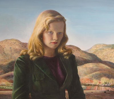
Peter Hurd had similar struggles with oil paints in particular. While it was his mentor N.C. Wyeth's medium of choice, Hurd never felt fully comfortable with it, feeling it was too thick, too murky for his particular artistic vision. Not that I blame him: N.C.'s illustrations are practically exploding with masterful energy, and Henriette Wyeth had a subtle understanding of painting's ethereal dimensions by the time she was a teenager, so I imagine that would have been pretty daunting to live and work around. Instead, it was the dry translucency of egg tempera that seemed to express his artistic voice most effectively, capturing the eerie clarity of New Mexico light that fascinated him throughout his life. In a lot of ways, that's how I feel about printmaking. The process-driven nature of the medium reflects the overall methodical approach I take to my own life, while more drawing-based approached such as acid etching and sketching reflect my occasional bursts of spontaneity.
 |
| Henriette Wyeth, Iris, 1945, oil on canvas. Roswell Museum and Art Center collection. |
 |
| Peter Hurd, Portrait of Peggy, 1948, egg tempera on panel |
I have to admit though, it felt rather satisfying to have a completed that still life by the end of the weekend, considering how long it can sometimes take me to finish printing my editions, assuming I don't lost interest in them during the process. As part of the workshop I received two canvases, in addition to the paints. I took the second one home with the intention of doing another still life, but the inability to decide on a composition soon resulted in me putting the canvas in the closet and forgetting about it. After all, there were cups to throw, coloring books to make, and holiday cards to construct, not to mention my curatorial work, so it vanished. After all, I'm just a pretend painter, so what I do I care if I don't complete a second one?
About a year later, however, I found the canvas while reorganizing my closet, and decided it was time to use it up. I started the usual debate about what to paint, which was beginning to paralyze my resolve to work at all, until I remembered doing a series of sketches with eggs and drapery the previous winter. I reasoned that focusing on such a deceptively simple composition would allow me to concentrate more on the paint itself, rather than the minutiae of details. I excavated those sketchbooks and settled on the first composition, enlarging it on the canvas using the golden ratio to create a more balanced drawing. Whenever I paint, I notice that I become very traditional.
I pulled out my paints and prepared to work. For canvas paintings I tend to use acrylic, partly because it's what I know best, but also because I don't need my cat accidentally ingesting turpentine or stepping in oil paint.
Whereas with the skull still life I had launched right into putting color on canvas, for this work I decided to do an underpainting using a matte medium to thin my paints into translucent glazes. I worked in a pretty loose manner the first night, drawing in the forms with a burnt sienna:

On the second night I began building up the values to give depth to the composition.

The next night I decided to add a bit of warm by adding ochre to the mix, giving the overall composition a warm yellowish glow. After all, the original sketches had been done by candlelight, so I wanted to evoke that sense of light to some degree.

Now that I had built up a nice ochre-based composition, it was time to take a chance and add color. The eggs themselves were painted in the blues and greens of the actual shells. The original drape is actually woven with a floral pattern, but for this piece I distilled it to a single vermilion color. I debated a series of colors before settling on the red, but I'm not surprised that I would choose it. For me, red connotes warmth, the home, comfort. It's the color equivalent of the hearth fire, that trope of domesticity that's been celebrated since the nineteenth century. In retrospect, the combination of red and green also appears in a lot of my personal associations. The red I used here is pretty close in shade to the flowers blooming on my cactus right now, and the idea of red space with green accents is a concept I've loved ever since I saw the library in Sir John Soane's house in London as a college student. There's also the Christmas association, I suppose, and in the New Mexico vernacular in particular, "christmas" refers to a combination of red and green chili, say when ordering an enchilada. In short, it's a loaded color combination for me.

Over the next few evenings, I added glazing and scumbling to add highlights, shadows, and reflected light to the composition, enhancing its three-dimensionality.

Finally, I let loose with the brush and added some texture-suggesting strokes. I tend to paint pretty thinly to conserve materials, paints aren't cheap after all, but I figured a little brushwork wouldn't hurt, and might help me overcome my hesitation with the material. One of the reasons my paintings look fake to me is that I feel I hold back, as though I'm worried I'll lose control over the medium if I let loose in the same way as I do when I draw.
After working intermittently for a couple of weeks, I had this:

And here are some details:


I took a few liberties with the composition. The eggs weren't this speckled in reality, for instance, and I've concealed the cracks that developed in the shells when I was extracting the yolks. And of course, the drapery wasn't this solid red color. The beauty of art though, is that you can manipulate reality to suit your needs.
I still don't consider myself a great painter by any means, but this feels the closest to a real painting I've done in a while. So much so, in fact, that I'm thinking of expanding it into a series.
How typical.
Doesn't it feel good to let yourself just "go" and express yourself? Loved it.Ralph
ReplyDelete